Easily create a mobile-optimized version of your site for smartphones, tablets, and other mobile devices!
You can easily enable or disable this feature by clicking on the Mobile icon located on the menu bar.
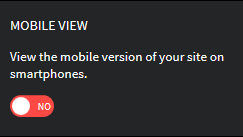
The Mobile feature is enabled by default. This feature can boost site traffic, customer satisfaction, and sales by enabling visitors to access your site via mobile devices.
You can also disable the feature should you’d like visitors on mobile devices to view a different version of your site.
Rearrange the content
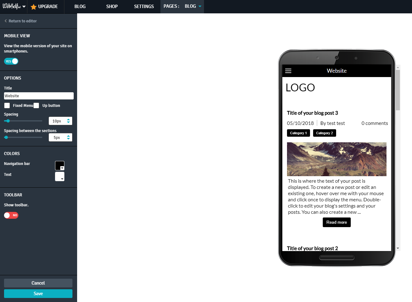
You can select which elements to display on your mobile version.
In the "Options"; section, your options are:
- Title: Customize the Title of your mobile version;
- Menu: Select to display a fixed Menu;
- Up button: Select to display the button "Back to top";
- Spacing: Control the space between the modulemodules.
In the "Colors" section, your options are:
- Navigation Bar: Customize the navigation bar color;
- Text: Customize navigation bar text color.
Enable Mobile navigation bar
The Mobile toolbar is an add-on bar displayed at the bottom of your site when accessed by a mobile device. It allows your visitors to contact you through the action icons, such as phone, email, or mailing address.
Show the toolbar is disabled by default; click NO to activate it.
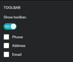
- Once the bar is activated, your options are:
- Phone: Check the box to display your phone number;
- Address: Check the box to display your contact details;
- Email: Check the box to display your email address.
Click ‘Cancel’ to cancel the changes.
Click ‘Save’ to save the changes made.
Disable the display of an element from your PC
To help personalize your mobile version, you can choose the elements to display directly from your PC version.
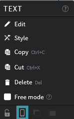
Every element of your content has an independent mobile icon. The display of your site elements on the mobile version is active by default.
To disable an element, left-click directly on the element, then on the Mobile icon. To enable it, click again on the Mobile icon.